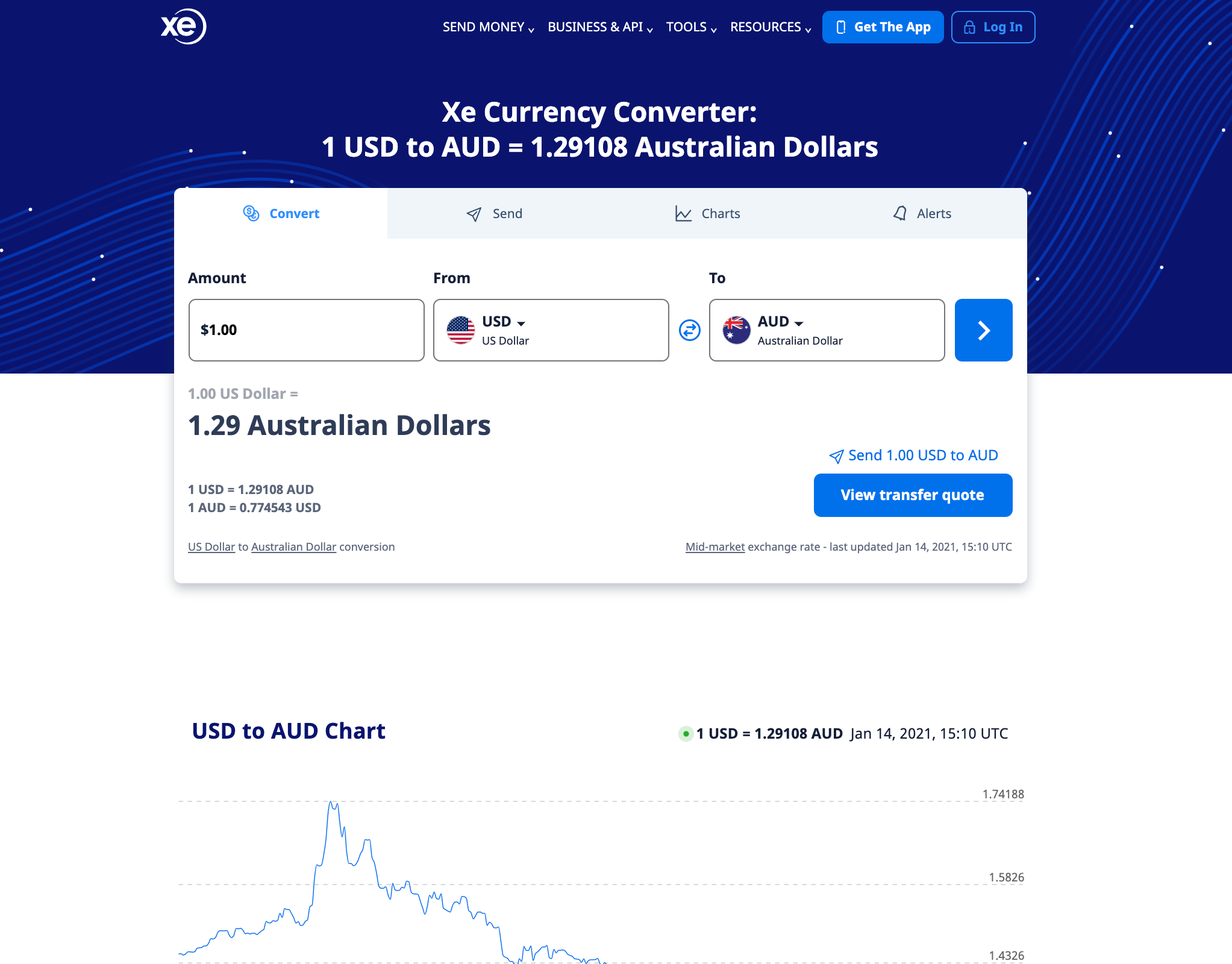
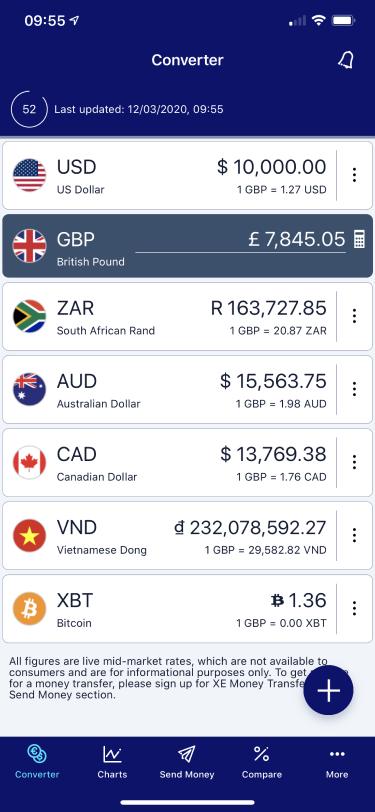
The XE currency converter app has been downloaded over 70 million times on both iOS and Android.
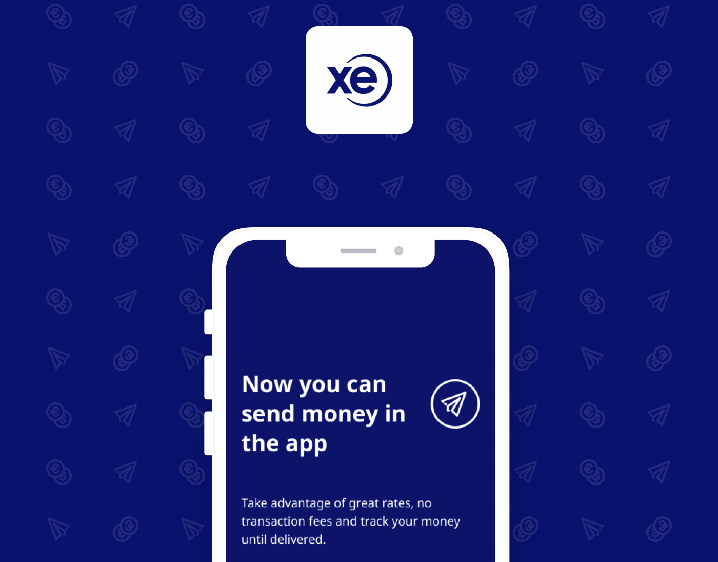
XE also had a secondary money transfer app. With a push from the business to focus more on our ability to let users send money, our goal was to integrate the money transfer app into the currency app, and create a cohesive experience that works for both old-school users and new.
A Quick Win
A first step towards creating a cohesive experience would be to find the fastest way to start educating currency app users about XE's money transfer services. We had to decide between deep-linking the currency app and money transfer app or creating one app to do it all.
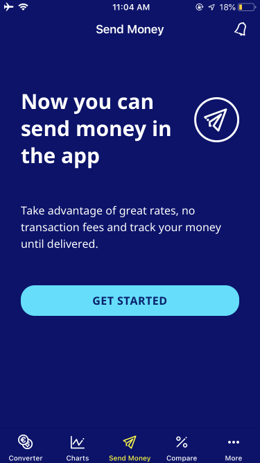
Ultimately the business decided creating one app would be the best fit for XE. Previously, there was a money transfer tab in the app that linked to the website, but that tab would now lead users to their money transfer dashboard.
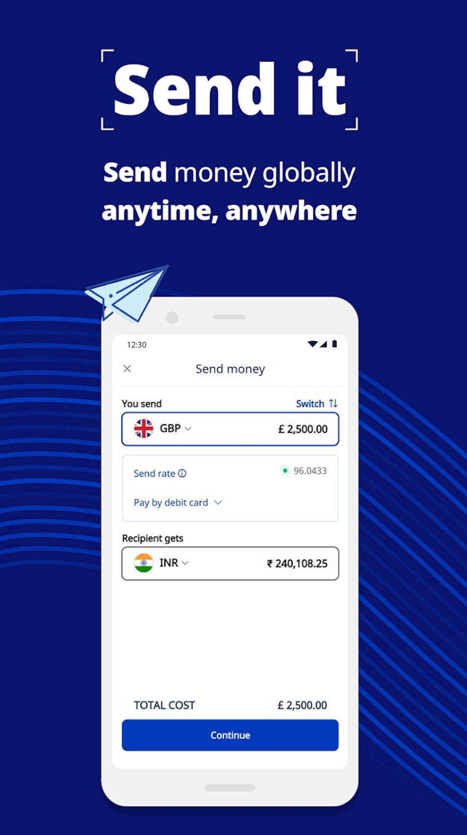
As a first step, we would inject the screens from the money transfer app in this space and reskin it to fit with the existing UI of the currency app. A critical factor to accomplish this would be to design a single-sign-on experience so that users could use the same set of credentials to both send money, and create rate alerts in a single app.
Building Momentum
With money transfer services now in the currency app, we bought ourselves some time to start reworking the process to create a smoother journey for users.
We knew we had an out-dated registration process and a clunky UI experience. Our next steps would be to find out how our money transfer flow would appeal most to our users and also how we could give XE a fresh start with an updated component library.
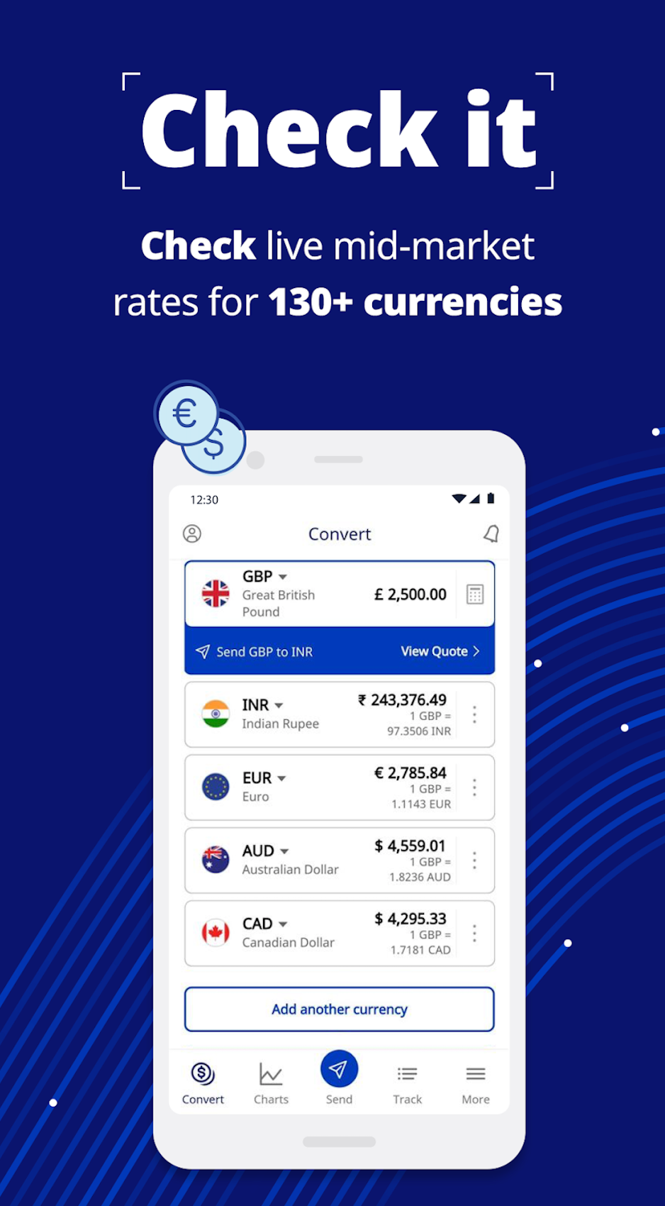
Screenshots of the currency app with money transfer functionality added in 2019
User Research
Thanks to a research campaign I ran in 2019, we were able to get a little over 1000 users that were willing to take part in user interviews and alpha/beta testing to help us get feedback for how we could improve our experience.
I would set up interviews with these users to test our existing money transfer experience and pick user's brains about how they sit with other competitors our users may have used.
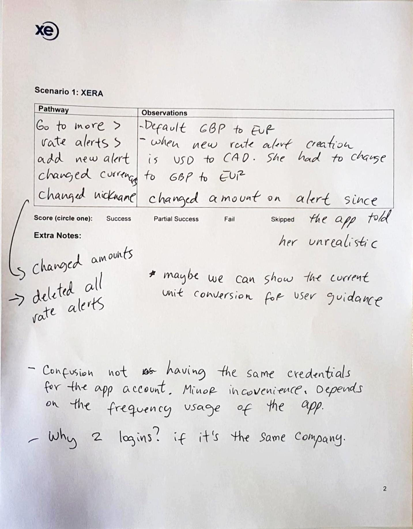
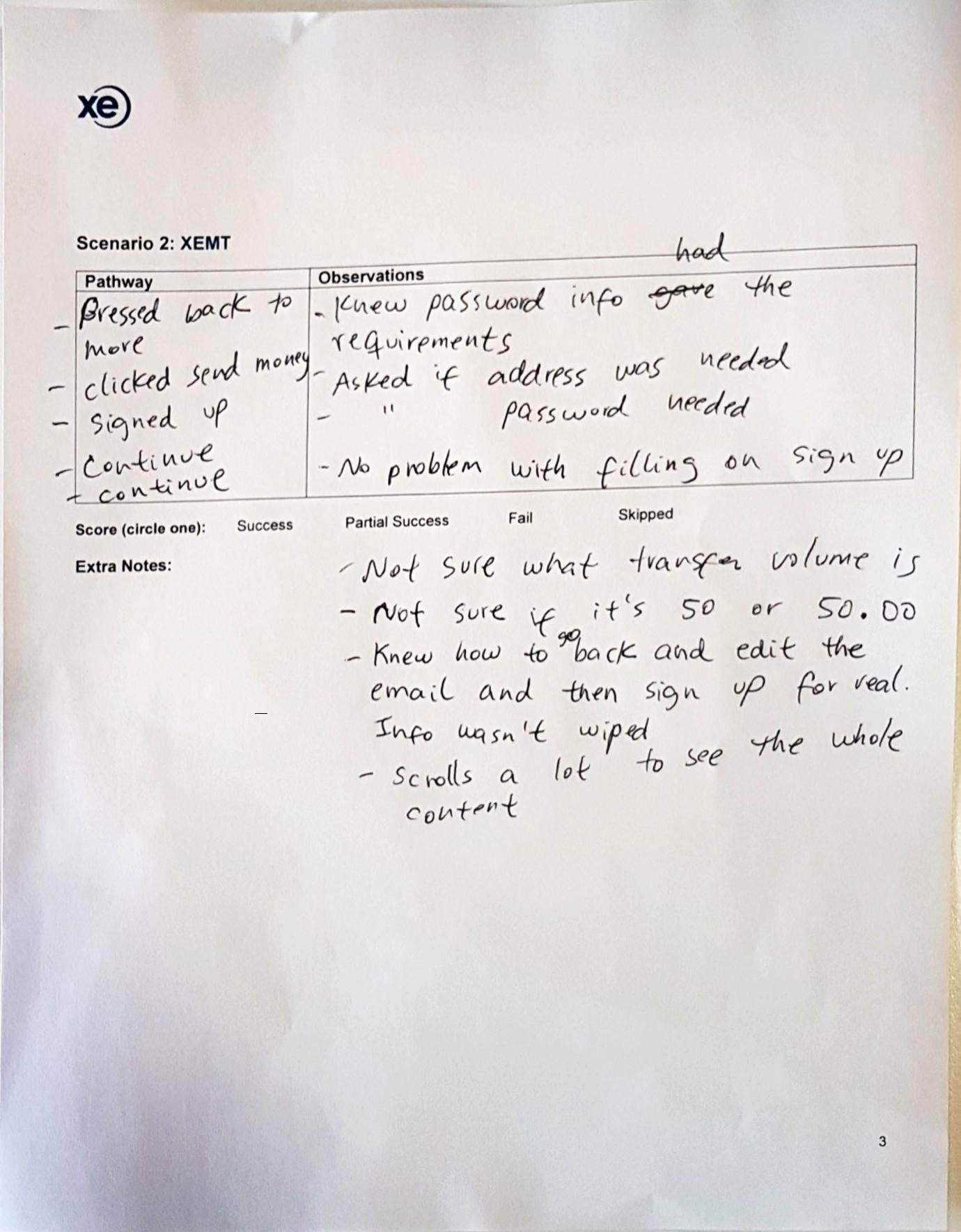
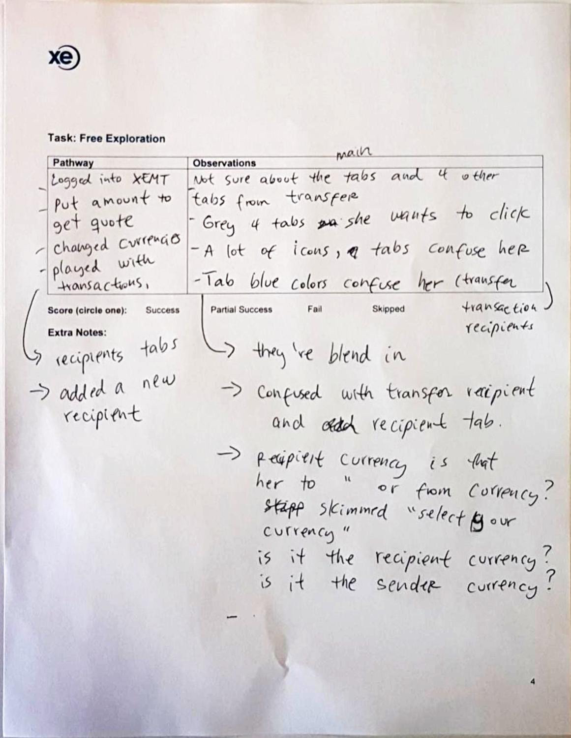
Some snaps-shots of rough notes taken during a user testing session
On top of user interviews and user testing, our team also compiled screenshots of competitor flows. This benchmarking exercise would help us gauge UI and UX standards.
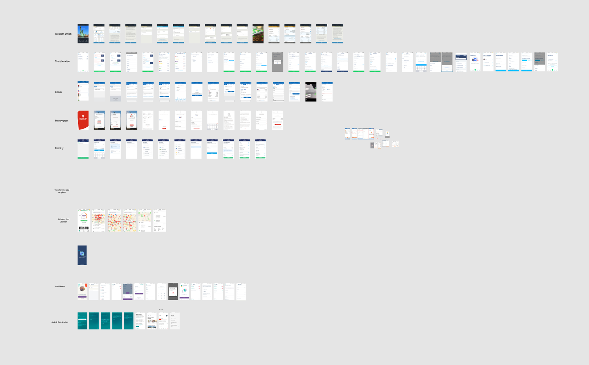
Screenshot of a competitor analysis page from our Figma archives
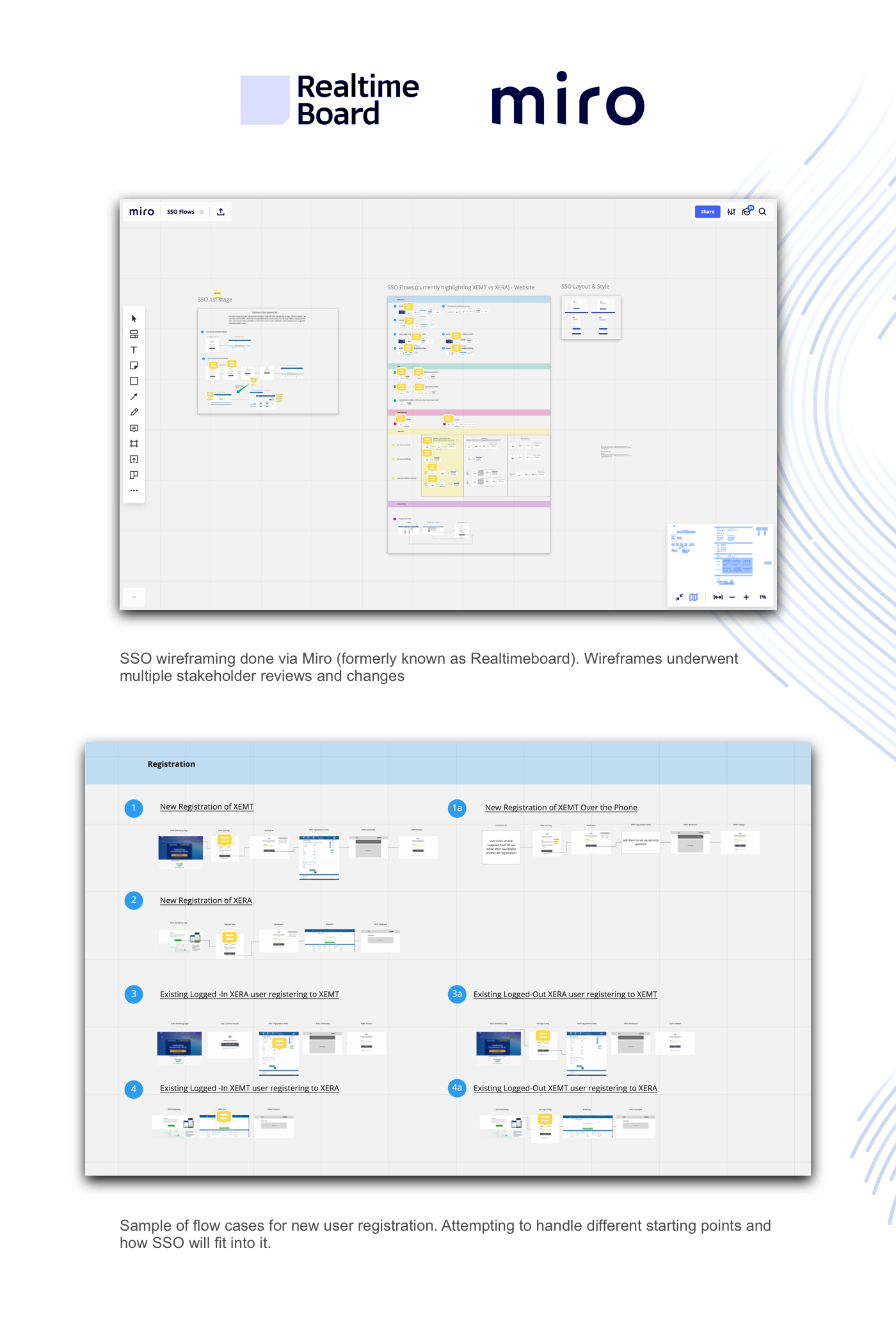
The Design Process
The app redesign process would be done entirely with Figma. This would allow the UX team to work in one place and allow product owners and other stakeholders to stay involved and get easy access to flows.

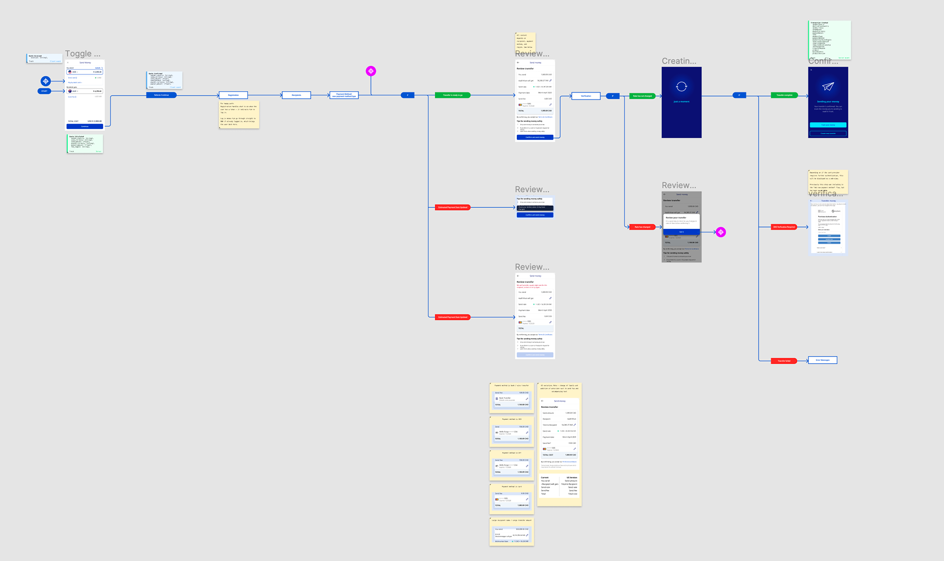
Screenshot from Figma depicting the money transfer flow
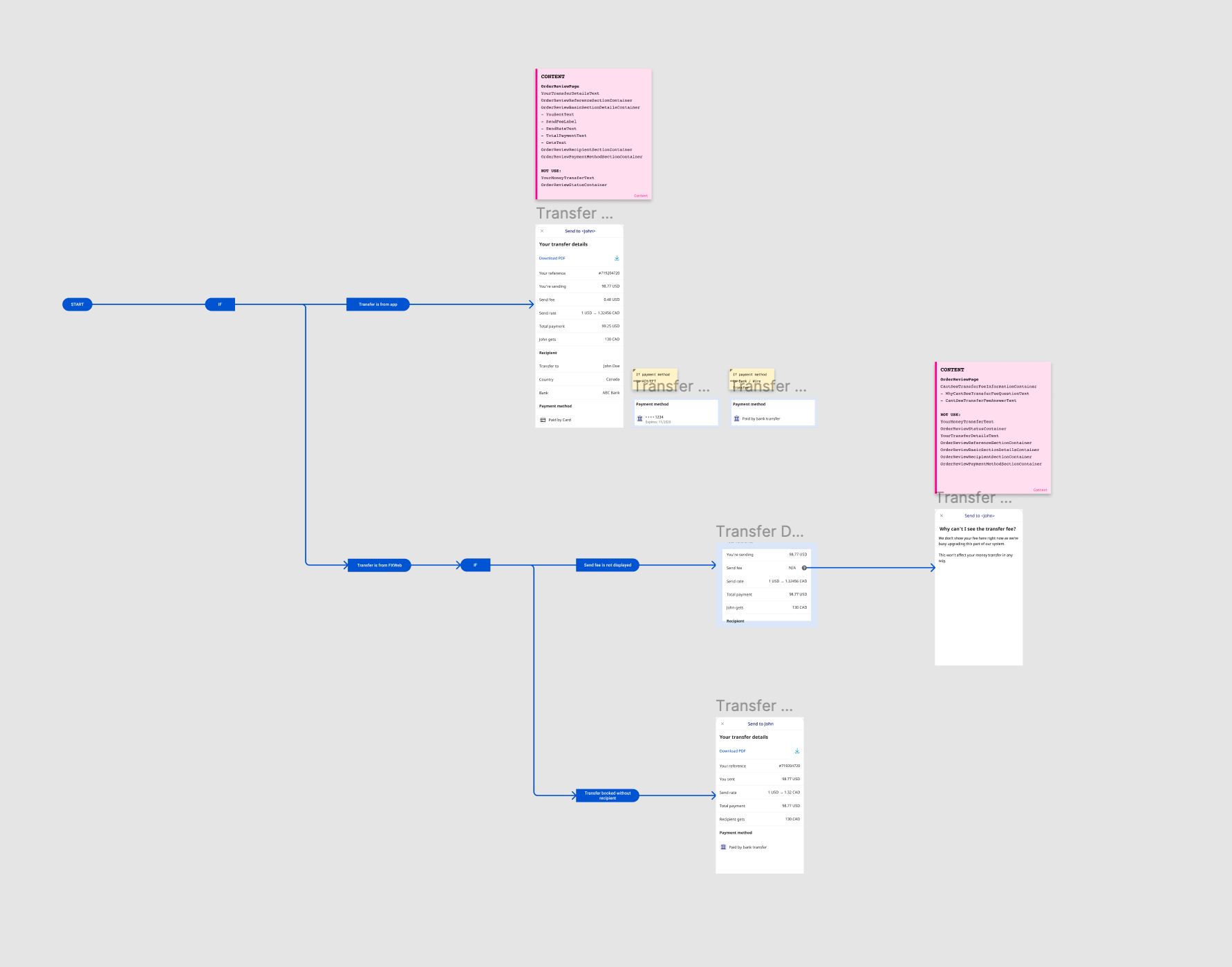
Another screenshot from figma. The pink cards are used to contain ID strings that map content to Contentful, used for localization purposes.
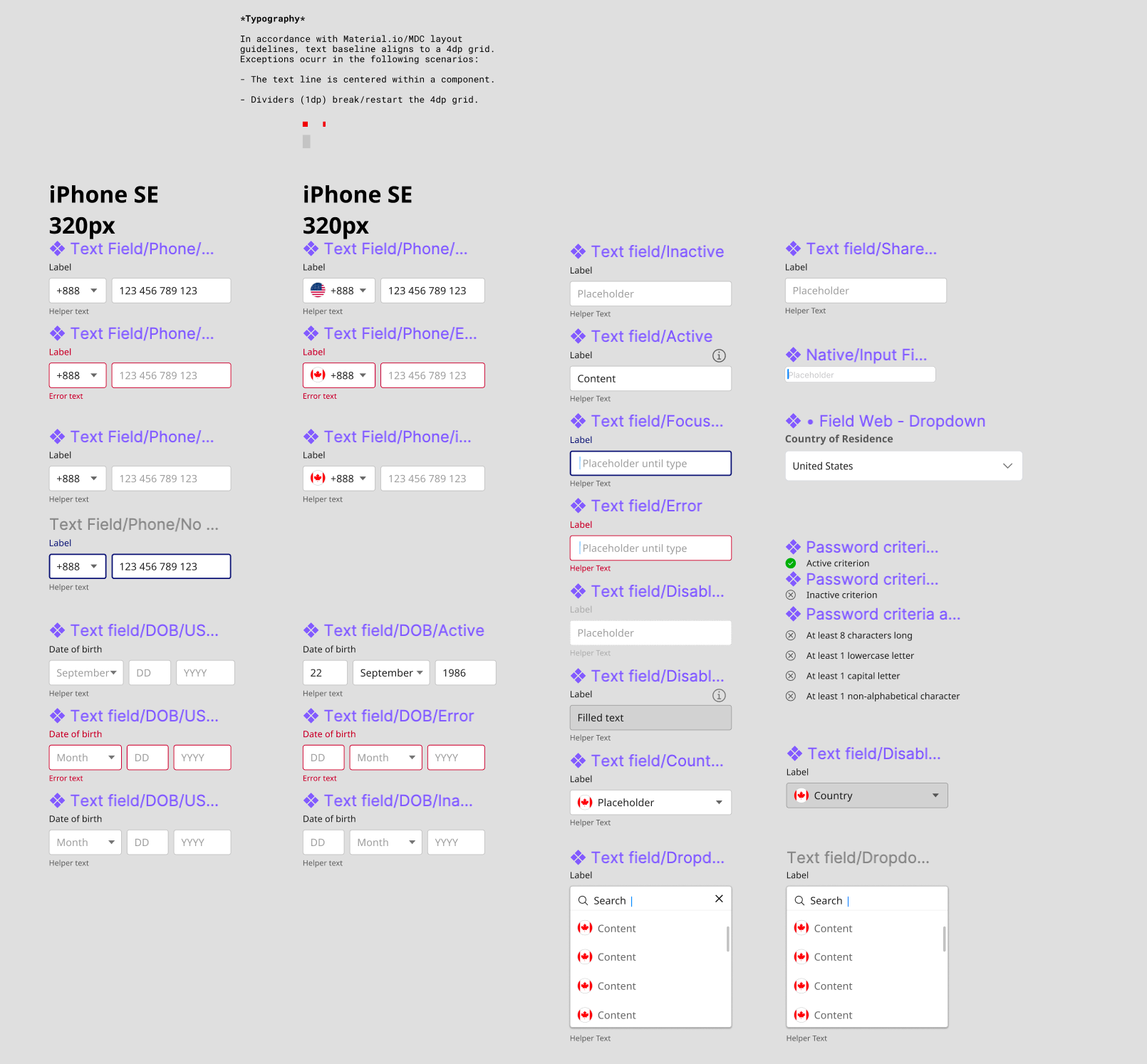
A screenshot from our component library
A Faster Journey
In the below video we compare the old app (left) to the new design (right) that had an internal nickname of "Project Apollo."
When going screen for screen, the new design is able to have a user register and make a transfer before the user with the old design can even set up their payment method.
New Features
The new app allows users to get rates and currency info just like they could before, but offers an all new way to send and track money.
On top of this, the app features a completely overhauled onboarding, sign-up, and registration experience.
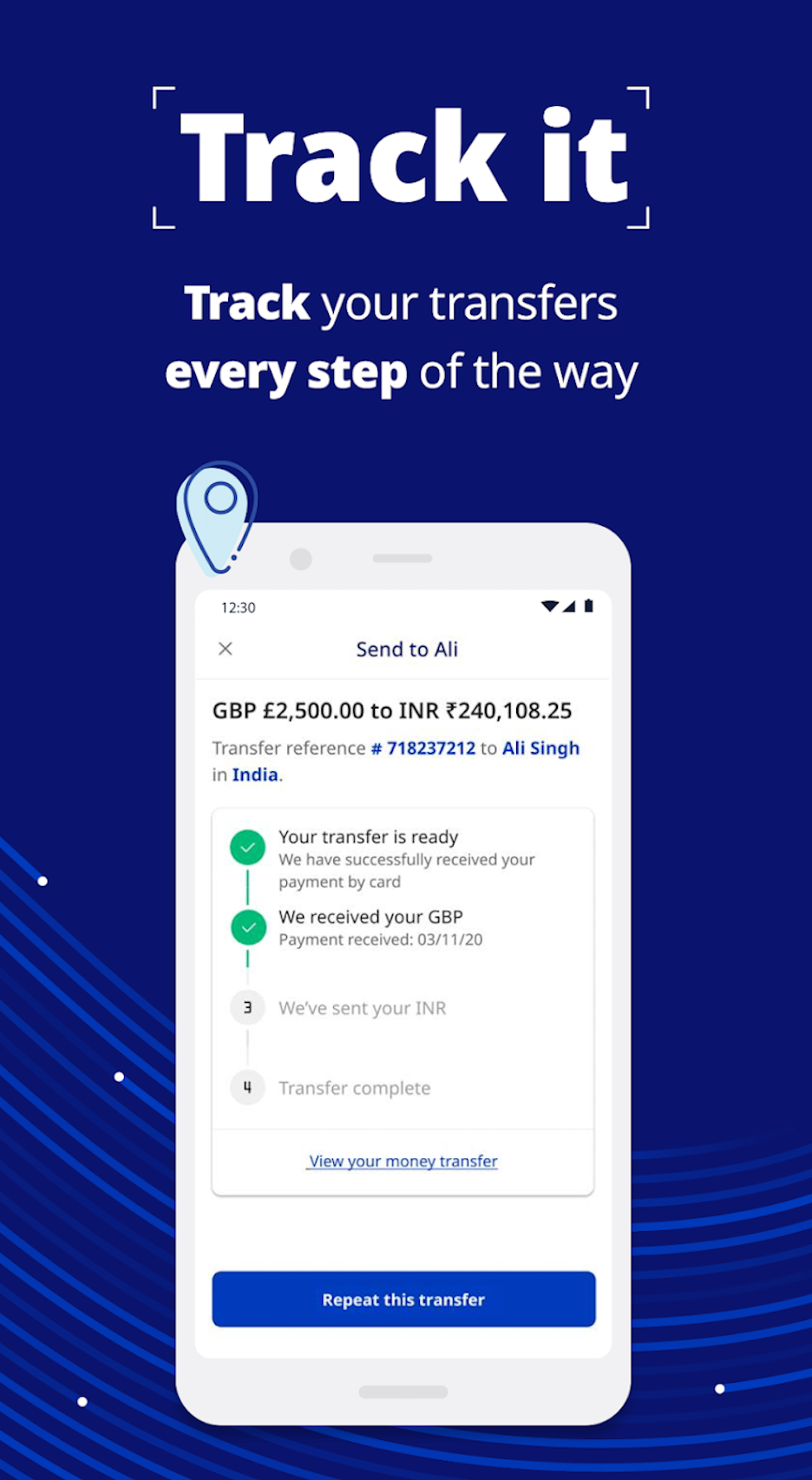
Tracking your transfer with the new XE App
Perfomance
While the app is in its infancy, our event tracking is showing an increase in registrations, and complete transfers compared with the previous app. We are still in the process of updating our flows and continuing to tweak designs to further support this increase.