About the Project
At the heart of XE lives a currency app that is used by millions of users to get everyday information about currencies relevant to them. The app lets you manage a list of currencies, get chart graphics, rate alerts, and provides a market analysis for your pleasure. In the centre of the navigation tab is an icon to transfer money with XE - linking to a lesser known service that the company offers.
To increase exposure to the service and make it more convenient to users, XE decided to integrate the money transfer feature within its currency app. XE Money Transfer already has its own app but due to a lack of activity the company decision was to merge the apps together to create one better app.
My role would be to architect the wireframes for the single-sign on journey, existing user migration, and what the flow would look like for the newly merged app. Our UX designer would take these flows and bring things to life with additional UI and UX work. With this done, the developers and product team could continue building and iterating on the project until completion. The whole team would be necessary to work together for this.
Method
When it came to SSO, my job was to listen to requirements and the framework established by our developers and create a series of flows that showed the entire SSO system.
We would have to focus on product registration, existing login flows, password forgot/reset flows and also existing user migration to the new SSO system.
XE currently has a series of services that all require a separate login. These include:
• XE Rate Alerts
• XE Money Transfer
• XE Currency API
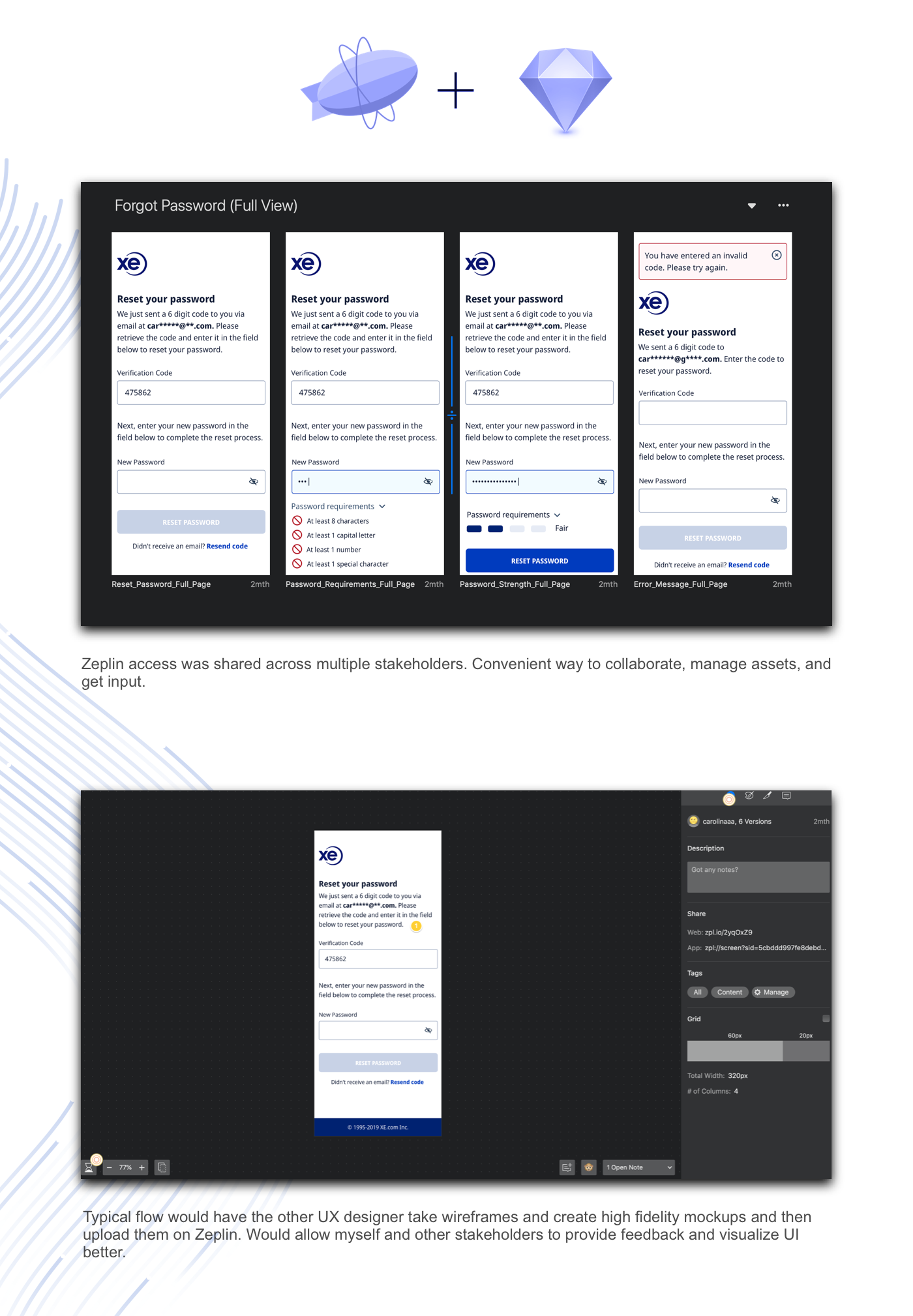
The best way to manage all of the flows was to use Realtimeboard. This service allowed me to send out public links to stakeholders and made it easy for people involved to provide feedback/comments.

The wireframes went through a series of reviews and took around a month to finalize. Sessions would include developers, designers, and members from the product team.
Once the flows were finalized. I handed them off to our UI/UX designer to apply our colour palette and bring the flows to life. Below are some of the screens she created
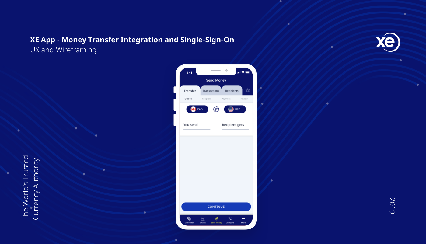
XE Currency App - Money Transfer Integration

With SSO's design completed it was time to move on to the XE Currency App and begin building out the design of the app with both the SSO integration as well as the money transfer integration.
Majority of the existing currency app would still be the same in terms of look and feel. The main sections of the tab bar include:
• Converter
• Charts
• Send Money
• Compare Tool
• More
Originally the money transfer tab featured some marketing text and a button to take the user to the web version of the service. With this update, all of the content from the existing money transfer app would flow into the currency app. Eventually the standalone transfer app would be killed off.

Once the flows were set, our UX designer tweaked the design to fit with the feel of the existing app.
To further reinforce our design choices, I took their work and ran a series of moderated user tests with XE's user testing community panel. With user feedback, we continued to tweak our designs and developers continued to work on building the final product.
Once again we ran another series of moderated tests but this time we kept the user-pool internal. In the future, more testing will be done and we are aiming to continue improving the UI and UX of the app.
Video done by another amazing XE designer - Paul Brown
Next Steps
With the app released its time to dig down and improve. There are a lot of points to work on. We are underway with testing, brainstorming, and gauging user reaction to continue helping users utilize XE to empower their international lives.